Redesigning the Healthcare Experience: Enhancing User Engagement and Usability
This case study details the comprehensive redesign of the Longevity One app, addressing the limitations of its previous simplistic interface that offered minimal guidance. By incorporating user feedback and insights, the new design enhances usability and engagement through intuitive navigation, community-driven ratings, and informative content. Ultimately, this redesign seeks to empower users on their health journeys while fostering a supportive community around longevity-focused treatments.
Product designer
2 Weeks
Remote
Company
Longivity One
Healthcare
Problem
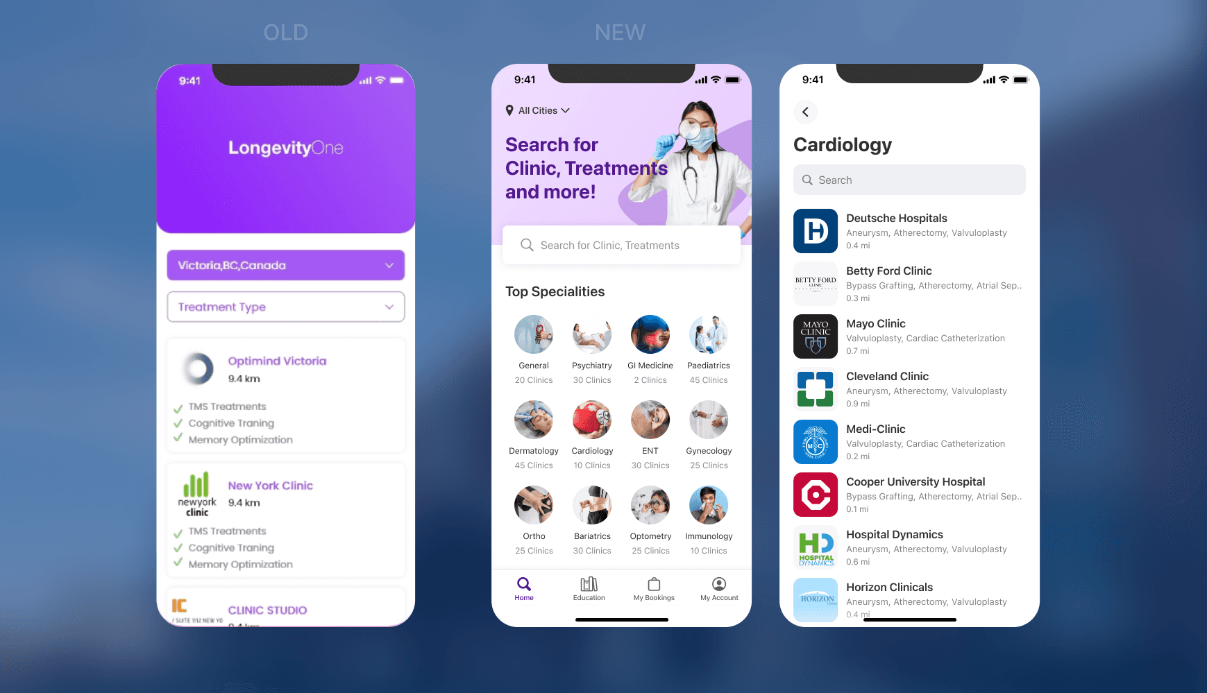
The current healthcare app has significant usability challenges due to its outdated design and lack of essential information. Users struggle to navigate the app and find relevant health services, resulting in low engagement and high abandonment rates. Feedback shows that the app does not clearly communicate its purpose, leading to confusion and frustration. This lack of clarity prevents users from making informed decisions about their health treatments, negatively impacting their overall experience. A redesign is necessary to improve usability and ensure users can easily access the information they need.
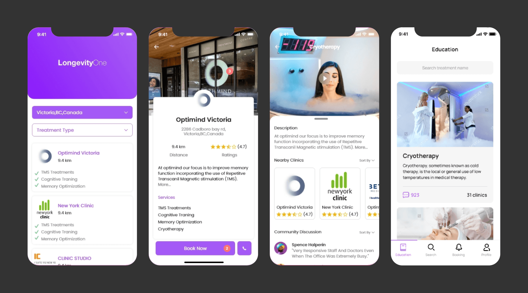
Process
Research & Analysis: We conducted user interviews, surveys, and analyzed in-app analytics to understand the pain points and user needs. We also studied competitor apps and industry trends to gather insights
Information Architecture: Based on the research findings, we restructured the app's navigation and content, prioritizing features and information according to user needs.
Wireframing & Prototyping: We designed low-fidelity wireframes to visualize the new layout and navigation, iteratively refining them based on user feedback. Afterward, we built a high-fidelity, interactive prototype to test the design.
Usability Testing: We conducted usability tests with a diverse group of users to validate the design and identify areas for improvement. Based on the feedback, we made necessary adjustments to the design.
Visual Design & Style Guide: We developed a cohesive visual language, including color schemes, typography, and iconography, ensuring consistency throughout the app. We also created a style guide to maintain design consistency in future updates.


Figma workfile
Dark mode

Conclusion
The development of the mobile health tracking app demonstrated the importance of balancing functionality and usability in app design. By focusing on creating an intuitive and engaging user experience, we were able to support users in achieving their health goals and maintaining a healthier lifestyle. The app's success underscores the value of thoughtful design and user-centric development in the health and wellness industry.