Redefining Client Comparison tool
Investors should have the option to compare clients within the same asset class, with a maximum of four clients to be compared at a time. Users should have multiple methods for making these comparisons. The system should provide suggestions for clients to compare based on investor portfolios and similar clients, utilizing data science clustering techniques. Additionally, users should have the option to search for and enter a client for comparison within an asset class. They should also be able to filter their portfolio clients to identify suitable candidates for comparison

Ottawa, Ontario, Canada
2006
E-commerce
$1.578 billion (2019)
5,000+
Project Goals
Users should be able to view both a snapshot and a detailed view of all client attributes.
Present the performance of comparable companies across multiple parameters within the same sector to facilitate decision-making for various internal and external stakeholders.
Provide investors with insights on how similar comparable companies perform relative to the company being evaluated, aiding in the decision-making process.
Investors should be able to compare portfolio or interested clients in detail across various attributes.
Investors should be able to compare all clients at a snapshot level on specific attributes, while internal teams should have the capability to compare any client in detail across attributes.
If the client is a portfolio client for an investor
Display an overall snapshot of individual items, as detailed in the sections below, along with the detailed comparison sections.
If one client is a portfolio client and another is not, provide a snapshot comparison for the non-portfolio client while offering a detailed comparison exclusively for the portfolio clients.
If the client is not a portfolio client
Display only the snapshot section for comparison


Lets Get Started!
In this case study, I won’t delve into detailed wireframes and visual designs. Instead, we will focus on a few key screens and the design decisions made for them. Below are examples of the existing screens alongside the refactored designs. Scroll down to take a look before we dive into the persona and design decisions! 😇
Landing screen
This is the starting point where investors land on the platform to compare and filter clients of interest.
Search and filter clients
From this screen, the investor can browse through the list of clients available on the platform, view recommended clients, and apply filters to select specific clients of interest.

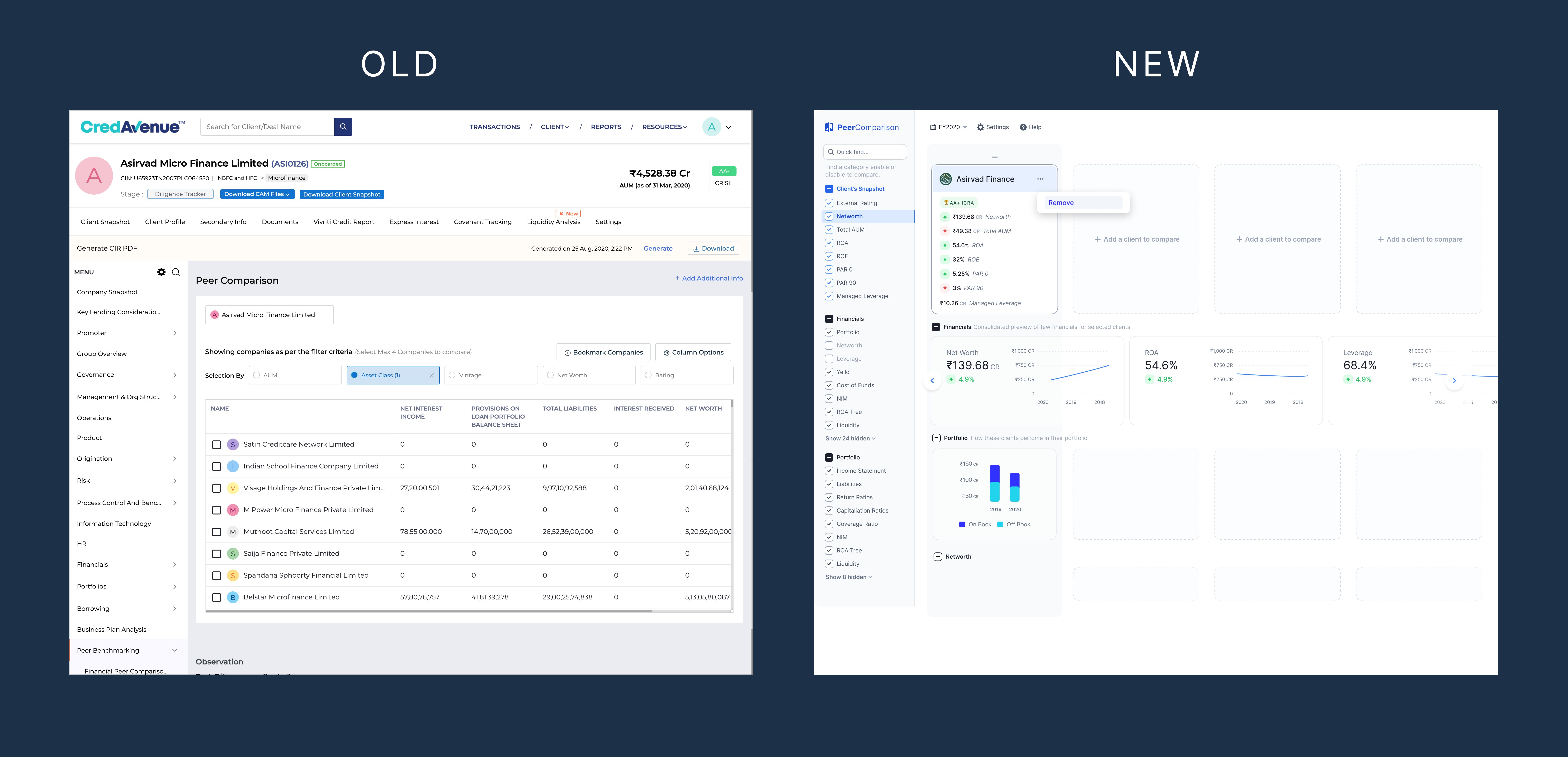
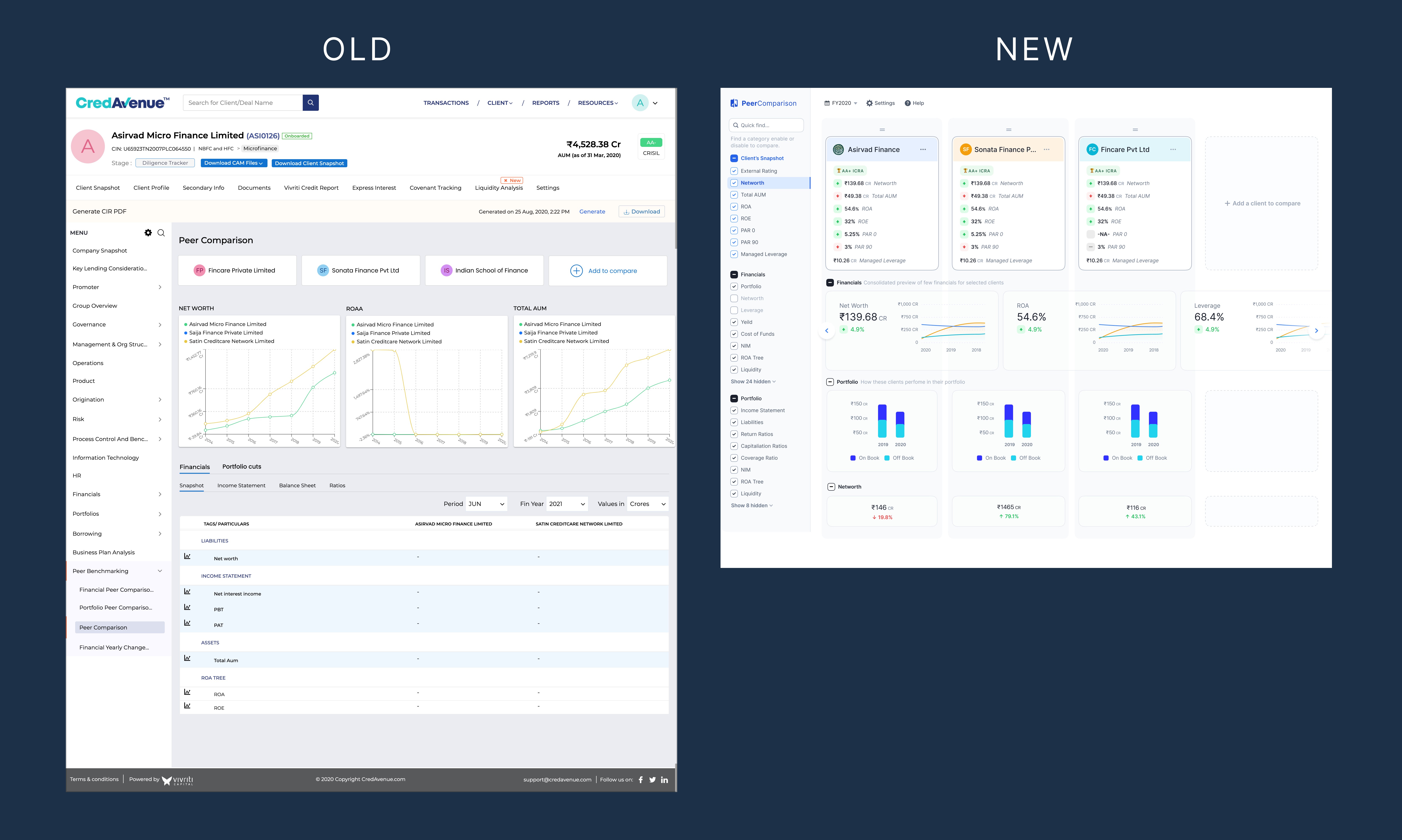
Client comparison screen
Three clients have been added for comparison, and their financial details are populated for the investor to analyze and make informed decisions.
Wireframes

Solutioning #1: Slide-out Pane vs Modal
One of the crucial challenges we faced was whether to use a popup or a slide-out pane. The user needs to add clients for comparison, selecting them from our recommendations or overall list, and filtering based on factors such as sector, rating, and net worth. This feature is designed to act as a tool for investors, used occasionally while exploring options before investing. They will be able to add up to four clients for comparison.
We had extensive discussions within the UX and business teams about the best way for users to achieve their goals. Our aim was to find a responsive, user-friendly, and consistent option across the application
Visual Design
#Option A: Modal Pop up

#Option B: Slide-out pane

Solutioning #2: Add clients
Another lengthy discussion we had was about finding a better placement for the "Add Clients" action button. The objective is to create an intuitive call to action (CTA) that encourages investors to easily select the button and add clients for comparison.
#Option A: Floating Button

#Option B : Tabs
In this option, we implemented buttons in the form of chrome tabs. By default, one client is added to the tool, and by clicking the blue plus button, the investor can add multiple clients for comparison.

#Option C : Columns
This is the option we ultimately decided to proceed with. To address the shortcomings of the previous design, we adopted a different approach by incorporating placeholder rows and columns into the layout. This design intuitively encourages users to add clients and initiate comparisons.

Option C is the winner 🥇
During A/B testing with users, option C received positive feedback, with participants expressing that it felt more intuitive and straightforward when using the tool.
Results
65%
User Engagement Rate
40%
Decision-making Time Reduction
Takeaway
We have utilized various comparison tools in the past to evaluate products such as mobiles, automobiles, and electronic devices. However, developing a comparison tool for the financial sector—one that presents client financials, graphs, and analytics in a compact format—proved to be quite challenging. Given that this tool is unique and has no direct market references, we had to immerse ourselves in the perspective of the investor (the user) to navigate these challenges effectively.
This experience underscored the importance of visual hierarchy and how design and content must work together to enhance usability and the perception of information. Our goal was to ensure that users could grasp the necessary information in the least amount of time possible.